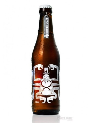
 I’m obsessed with beer and liquor packaging. I admit it and I do my best to share my obsession with the people around me.
A good label combines strong typography, illustration, and clear focus to communicate what the product is, to whom it’s speaking and what separates it from the competition. Not an easy task when a consumer is scanning a shelf of beer at the store. And that’s the thing: people don’t read, they scan. This is especially true in packaging but it applies across all media in varying degrees.
I also love book cover design for similar reasons but here’s the difference: a book cover describes the contents but a beer label describes both the contents AND me. As the craft beer market matures so does the packaging and the identity statements are becoming more nuanced and adventurous.